04 · Reducing Energy Waste by 32% Across a 14-Building Portfolio
← Back to home
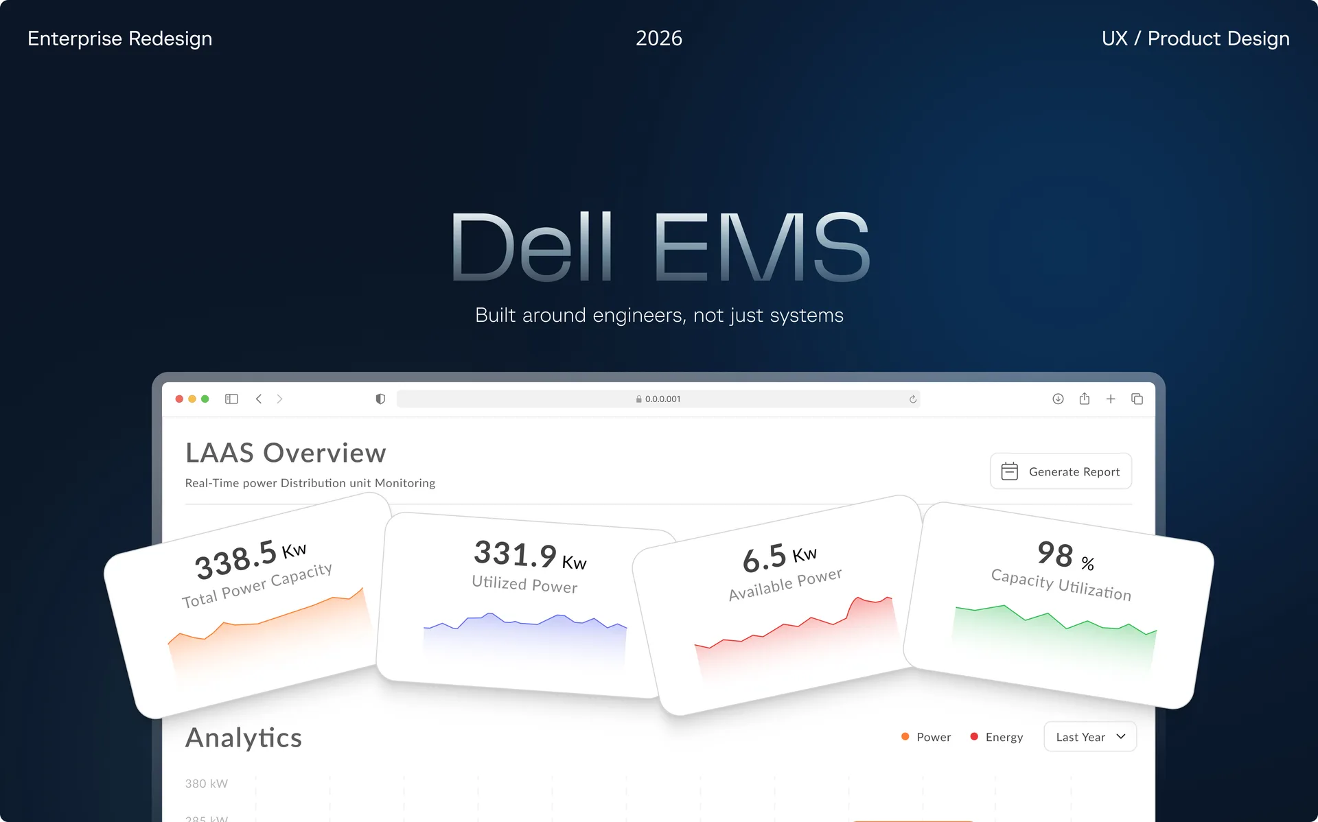
Overview
Energy management systems are notoriously difficult to use well. They sit at the intersection of industrial engineering, real-time data, and high-stakes decision-making, yet the interfaces that power them are often built by engineers for engineers — leaving facility managers and sustainability leads drowning in numbers with no clear path to action.
This case study documents the end-to-end UX process behind redesigning an EMS platform for a global-sized American technology company managing 14 buildings across the Asia-Pacific region (APAC).
My Role
UX Designer. I led the process end to end — research, synthesis, design, and validation — over a 6-month engagement, conducting 18 stakeholder interviews and running six rounds of usability testing across 18 participants to redesign how facility managers, building engineers, and sustainability directors interact with energy data.
Outcomes
32% Less WasteReduction in energy waste after rollout across all 14 buildings
2x FasterResponse time to flagged issues
14 BuildingsRolled out across the APAC portfolio over seven months
ProblemWhy the old system failed
The existing system was technically capable but operationally ignored: alarms went unacknowledged, energy consumption spikes went unnoticed for days, and sustainability reporting was done manually in spreadsheets.
"The system shows us everything happening in the building — but we only understand it when something goes wrong." — Facility Manager, Client Interview
Before redesigning, I mapped the failure modes of the existing platform through stakeholder interviews, contextual inquiry sessions, and three months of system logs. Five major issues emerged.
ResearchUnderstanding the people behind the screens
I conducted 18 in-depth interviews across three role types — facility managers, building engineers, and sustainability directors. Each had fundamentally different mental models, goals, and levels of technical fluency, which meant one interface could not serve everyone equally well.
Three roles, three timescales
A critical insight from the research: the three roles interact with energy data at completely different time scales.
- Facilities Manager: needs a real-time view — is everything running properly, what's wrong today.
- Building Engineer: needs a recent-past view — what caused this.
- Sustainability Director: needs a months-to-years view — are we on track toward our targets?
DesignRethinking the system structure
The biggest change I made wasn't visual — it was structural. The system was originally organized around technical categories like HVAC, lighting, power, and water. That made sense from a system perspective, but it didn't match how people actually worked.
So I redesigned it around roles instead. Rather than navigating through system types, the interface now adapts based on who's using it — a facilities manager, an operator, and a sustainability lead each see the same underlying data, structured around their own responsibilities.
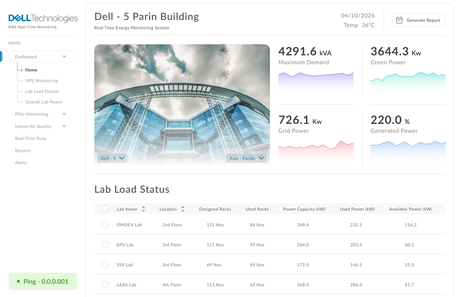
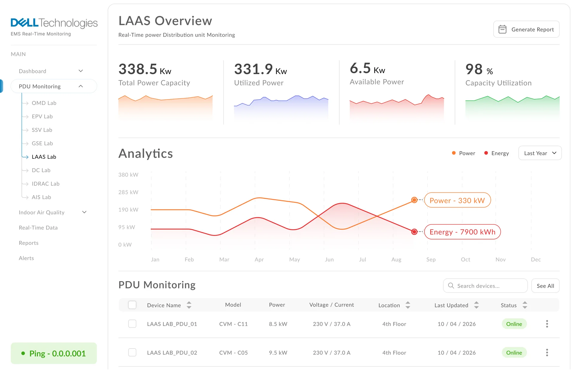
The Facilities Manager dashboard.
Built around six rounds of usability testing with 18 participants, iterating on information density, color theory, and alert hierarchy.
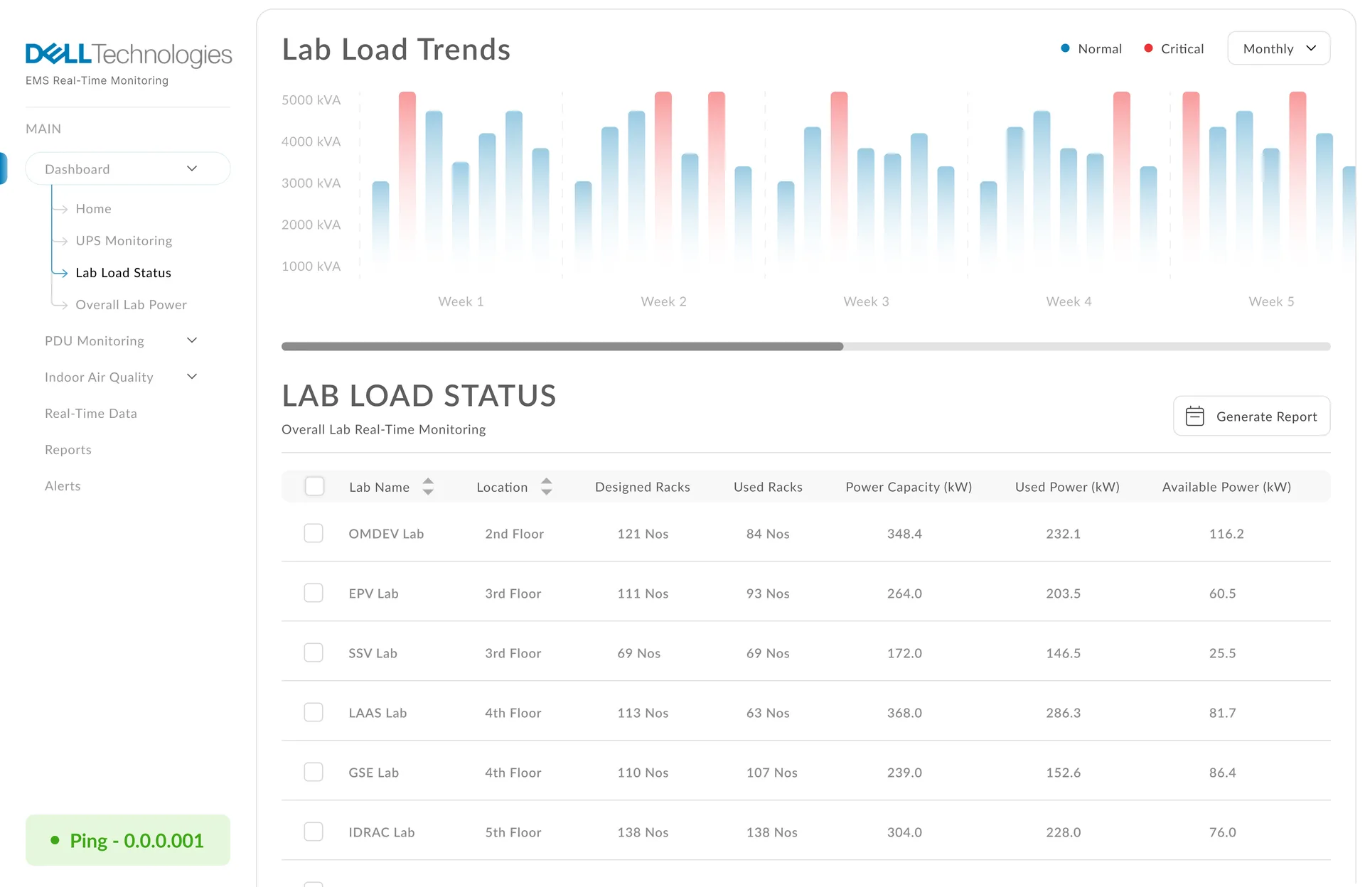
The Engineer's dashboard.
A recent-past view focused on root cause, not just current state — what caused this, not just what is wrong.
The Sustainability Director's dashboard.
A longer-horizon view built around progress toward targets, not day-to-day operations.
ReflectionResults after six months
The redesigned EMS platform was rolled out across all 14 buildings over seven months, with results measured against the baseline metrics defined during the research phase.
"For the first time, I open the dashboard in the morning and actually know what I need to do. That's all I ever wanted." — Facilities Manager, post-launch survey
This case study covers research, synthesis, design, and validation conducted over a 6-month engagement. Names and specific metrics have been adjusted to protect client confidentiality; the design system and interface patterns described here are my original work.
© 2026 Parthi Guru. All rights reserved.